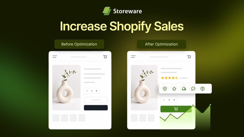
Your Shopify store is getting traffic, your ad spend is climbing and your sales are staying flat. The instinct is to blame the theme and start planning a full redesign. In most cases, that is the most expensive way to solve a problem that you can fix in an afternoon.
A redesign takes weeks, costs thousands and puts every part of your store at risk at once. The truth is that most lost sales do not come from an ugly store. They come from a stack of small friction points that quietly bleed revenue on every visit.
This guide walks through seven conversion fixes that increase Shopify sales without a redesign. Each one works inside your current theme, most take under an hour and every one is backed by data on how real shoppers behave. If you want a broader design foundation to pair these with, our 2026 Shopify web design guide covers the layout and UX principles behind the tactics below.
TL;DR
- Improve conversions before investing in a costly Shopify redesign. Small UX fixes often deliver faster and better ROI.
- Optimize mobile product pages by showing the product name, price, variants and Add to Cart button above the fold.
- Reduce cart abandonment by displaying shipping costs, free shipping thresholds and return policies before checkout.
- Place reviews, ratings and customer photos where buying decisions happen to build trust and confidence.
- Add an inline FAQ to answer common pre-purchase questions and remove buying hesitation.
- Simplify product options with mobile-friendly selectors, clear price updates and conditional fields.
- Speed up your store by compressing images, removing unused apps and replacing heavy homepage sliders.
- Streamline checkout with one-page checkout, guest checkout, express payment methods and trust badges.
- Use the provided no-redesign checklist to identify and fix conversion leaks across your store.
- Focus on continuous conversion optimization to increase Shopify sales without changing your store’s design.
Why Conversion Fixes Beat a Redesign Every Time
Conversion rate optimization has the highest return on investment in all of eCommerce marketing. You are not paying for new traffic. You are extracting more revenue from every visitor you have already earned.
The math is simple. Take a store with 10,000 monthly visitors converting at 1.4%. That is 140 orders. Lift the conversion rate to 2.8% and the same 10,000 visitors produce 280 orders without a single extra dollar of ad spend.
💡 The bottom line is that a redesign changes how your store looks. A conversion fix changes how your store performs. Only one of those directly moves your revenue.
Fix 1: Move the Buy Decision Above the Fold on Mobile
Over 70% of Shopify traffic now comes from mobile devices and mobile converts at a lower rate than desktop. That gap is not caused by weaker intent. It is caused by buy decisions being buried below three screens of scrolling on a six-inch phone.
A product page that works on a 27-inch monitor often fails on mobile because the price, the variant selector and the add-to-cart button all fall out of the first screen view. Fixing this is a reorder job, not a redesign.
What to do inside your existing theme:
- Put the essentials first: Product name, price and variant selector should sit within the first screen on mobile so the shopper sees the decision before any scroll.
- Add a sticky add-to-cart bar: A bar that follows the shopper as they scroll keeps the purchase action visible at all times. This is one of the simplest changes that consistently lifts mobile conversions.
- Lead with a benefit, not a paragraph: Three short benefit-focused bullet points above the long description answer the shopper’s first question in seconds.
- Let the product move: A short auto-playing product clip without sound builds confidence faster than a static gallery. An app like Vidify adds product video to your pages with no theme surgery.
None of this touches your brand, your colors or your layout structure. It reorders what the shopper sees first so the buy decision reaches them sooner.
Fix 2: Kill Surprise Costs Before the Shopper Reaches Checkout
The single biggest reason shoppers abandon a cart is unexpected extra costs at the final step. According to the Baymard Institute, 48% of shoppers abandon a purchase when shipping, taxes or fees push the total higher than they expected. Cart abandonment sits at roughly 70% across all of eCommerce, so this one issue is costing stores a fortune every day.
The important insight is that shoppers do not object to paying for shipping. They object to finding out about it at the last possible moment. Stores that display shipping costs earlier see meaningfully lower abandonment.
Fix the certainty problem with your current setup:
- Show shipping on the product page or in the cart: State the shipping cost or your free-shipping threshold before the shopper starts the checkout flow.
- Add a free-shipping progress bar: A simple bar that shows ‘You are $12 away from free shipping’ turns a hidden cost into a motivating goal and lifts average order value at the same time.
- State your returns policy in plain sight: A clear returns line near the add-to-cart button removes a silent objection for first-time buyers.
💡 Cart abandonment is rarely a pricing problem. It is a certain problem. Every cost you reveal early is a reason to abandon that you remove.
Fix 3: Put Reviews Where the Decision Actually Happens
Shoppers in 2026 are more skeptical than ever and they look for proof that other people trusted your brand before they part with their money. Social proof elements such as reviews, ratings and buyer counts reduce cart abandonment on their own and a real customer photo at the right moment does more for conversions than almost any design change.

The mistake most stores make is hiding reviews at the very bottom of the product page or leaving them off collection pages entirely. Reviews need to appear at the moment of decision.
Place your social proof for maximum effect:
- Add star ratings to collection thumbnails: A visible rating on the grid helps shoppers pick a product before they even open it.
- Show reviews directly below the buy section: Ratings and real customer photos placed right under the add-to-cart button answer doubt at the exact point it appears.
- Surface your best reviews on the homepage: A short review strip near the top builds trust the moment a visitor lands.
A review management app like TrustSync helps you collect customer reviews from multiple channels, display photo reviews and showcase trusted ratings throughout your Shopify store. It integrates with your existing storefront, making it easier to build credibility with authentic social proof where it matters most.
Fix 4: Answer Buying Objections Right on the Product Page
Sometimes a shopper has one specific question standing between them and the buy button. ‘Do you ship to Canada?’ ‘Will this fit a 15-inch laptop?’ ‘How long does delivery take?’ When that answer is missing, the shopper leaves to find it and most of them never come back.
Live chat solves this for shoppers who ask. A large share of buyers will not ask at all, so the smarter fix is to answer the top questions before anyone has to type them.
Build objection handling into the page itself:
- Add an inline FAQ block on product pages: Cover shipping times, sizing, materials, returns and compatibility in a collapsible section near the buy area.
- Answer the five questions that stall the sale: Pull the most common pre-sale questions from your support inbox and put those answers where the decision is made.
- Keep the page clean: A collapsible FAQ delivers the answer without pushing the buy button further down the page.
An app like StoreFAQ adds a searchable, on-brand FAQ section to your product pages so shoppers get instant answers and you remove the last hesitation before checkout. This is objection handling that works around the clock with no theme redesign.
Fix 5: Remove Friction From Product Options & Variants
Every product that needs a choice adds a small moment of effort. A confusing variant picker, a color swatch that is hard to tap or a custom text field that breaks on mobile turns interest into hesitation. In stores with configurable products, this is one of the most overlooked conversion leaks.
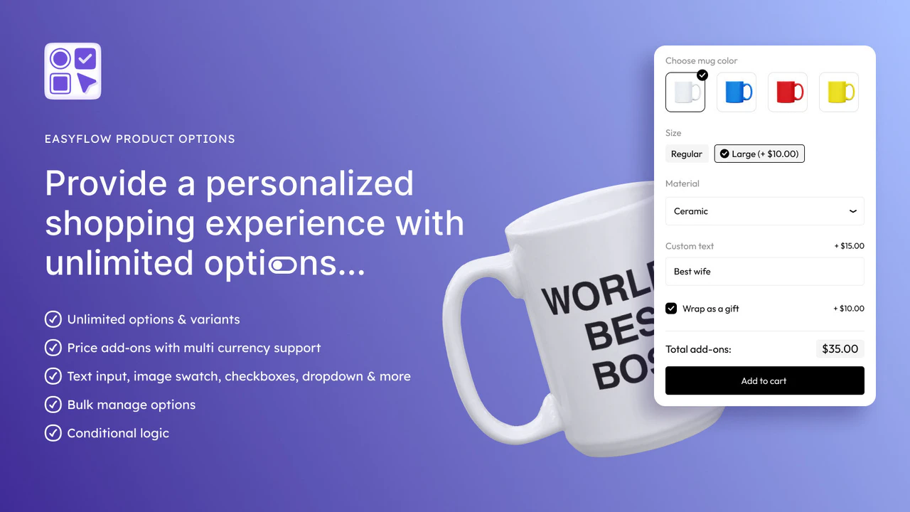
The goal is to make choosing as effortless as buying. A shopper who can configure a product in two taps is far closer to checkout than one who has to squint at a cramped dropdown.
Smooth out the configuration step:
- Use large, thumb-friendly option buttons: Swatches and buttons need to be big enough to tap on mobile without hitting the wrong one. A minimum tap target of 44 by 44 pixels is the standard to hit.
- Show the price change with the choice: When an add-on or upgrade changes the price, show that update the moment the shopper selects it so there are no surprises later.
- Add conditional logic for complex products: Only show the fields that matter for the option the shopper picked so the page never feels overwhelming.
A product-options app like EasyFlow helps you build clean, mobile-first custom options, file uploads and conditional logic on top of your current theme. Shoppers configure faster, reach the cart sooner and abandon less.
Fix 6: Speed Up the Store You Already Have
Site speed is a conversion lever disguised as a technical detail. Research from Portent found that pages loading in one second convert at 3.05% and pages loading in five seconds convert at just 1.08%.

That is close to a three-times difference from speed alone. A Google and Deloitte study found that even a 0.1-second improvement in mobile load time increased retail conversions by 8.4%. The best part is that speeding up your store needs no redesign at all. It needs cleanup.
Reclaim your load time with these fixes:
- Compress every image: Convert product and banner images to WebP and compress them before upload. Heavy images are the most common cause of slow Shopify pages.
- Audit your apps: Every app you install adds scripts to your store. Remove apps you no longer use and consolidate overlapping tools to cut the code your store has to load.
- Retire oversized homepage sliders: Auto-playing carousels with five or six slides are slow to load and rarely clicked. Replace them with a single strong hero image and a direct call to action.
- Track it weekly: Shopify’s built-in speed report under Analytics shows your score over time so you can tie speed changes to sales. For the fundamentals, Google’s Core Web Vitals guidance is the standard to design against.
💡 Speed is not a developer concern that lives separate from your store. It is a design decision, and it is one of the highest-leverage fixes you can make.
Fix 7: Streamline the Checkout You Already Run
The checkout is where the sale is won or lost, and it is also where the most recoverable revenue hides. Baymard estimates that better checkout design alone could recover $260 billion in lost orders across the US and EU eCommerce.
Two of the top three abandonment reasons, forced account creation at 26% and an overly long checkout at around 22%, are pure design choices you can remove today.
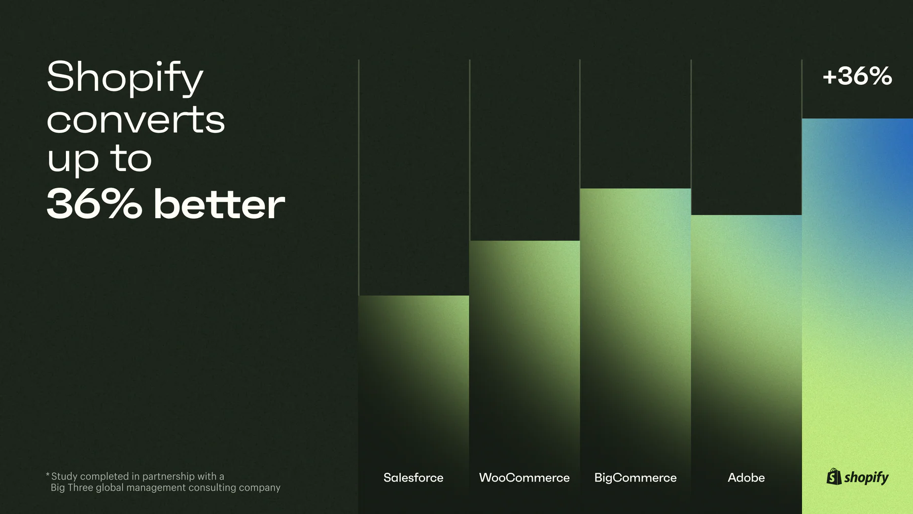
Shopify’s checkout is already built to convert. The fix is to stop working against it and take full advantage of what it offers.
Source: shopify.com
Tighten your checkout with these moves:
- Turn on one-page checkout: Shopify’s one-page checkout condenses shipping, payment and the order summary into a single view and removes perceived effort.
- Enable guest checkout: Forcing account creation before purchase is one of the top abandonment drivers. Let shoppers buy first and invite them to create an account after.
- Offer express wallets: Shop Pay, Apple Pay, Google Pay and PayPal give returning shoppers a one-tap purchase and consistently lift completion rates.
- Add trust badges near payment: Secure-payment logos and a money-back guarantee at the payment step reduce anxiety at the most sensitive moment of the purchase.
- Cut every field you do not need: Each extra form field lowers completion. Ask only for what the order truly requires.
Your No-Redesign Conversion Checklist
Run through this before you spend a dollar on a rebuild. It pulls the core moves from all seven fixes into one pass you can complete on your current theme.
- ✅ Price, variants and add-to-cart are visible without scrolling on mobile
- ✅ A sticky add-to-cart bar follows the shopper down the product page
- ✅ Shipping cost or free-shipping threshold appears before checkout
- ✅ Star ratings show on collection thumbnails and product pages
- ✅ Reviews with real customer photos sit below the buy section
- ✅ An inline FAQ answers the top five pre-sale questions
- ✅ Product options are large, mobile-friendly and show price changes
- ✅ Product images are compressed and served in WebP
- ✅ Unused apps and scripts are removed
- ✅ Mobile load time is under three seconds
- ✅ One-page checkout and guest checkout are both enabled
- ✅ Express wallets and trust badges appear at the payment step
Final Thoughts: Fix First, Redesign Later
A redesign is the loudest way to change a store and rarely the smartest first move. The stores that grow fastest in 2026 treat conversion as a series of small, measurable fixes and leave the giant rebuild as a last resort.
Start with the fix closest to your money: your checkout and your product page. Show the buy decision sooner, prove your store is trusted, answer the objection before it is asked and remove every gram of friction between interest and purchase. Stack even three or four of these fixes and the lift on your existing traffic will be measurable inside a single reporting cycle.
Your traffic is already paid for. These seven fixes help you keep more of what it earns.
If this guide helped you, subscribe for more simple guides, tutorials and tips to grow your Shopify store.