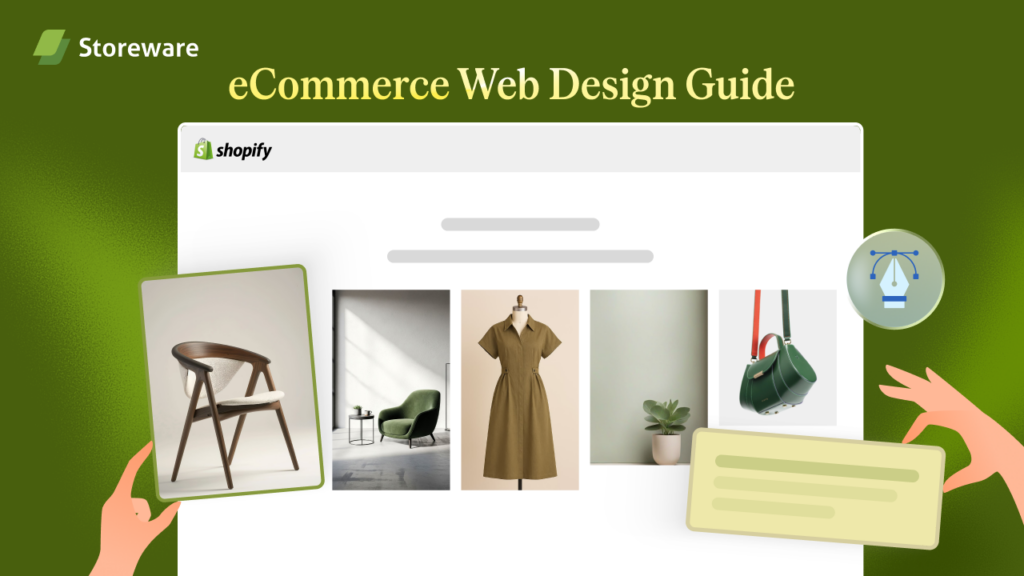
Your Shopify store might look beautiful but if it is not converting visitors into buyers, the design is not doing its job. In this Shopify web design guide, we will break down what actually converts in 2026.
From layouts and mobile-first principles to checkout UX and AI personalization, this guide covers everything a Shopify store owner, marketer or designer needs to know. Whether you are just starting out or refreshing an existing store, this web design guide will give you clear, actionable direction.
Why 2026 Is a Turning Point for Shopify Store Design?
The eCommerce space in 2026 is more competitive than ever. Shoppers are faster, more demanding and harder to impress. They make split-second decisions based on how a store looks, feels and loads. A slow page, a confusing layout or a clunky checkout can send a potential buyer straight to a competitor.
This Shopify web design guide for 2026 exists because what worked in 2022 or even 2024 no longer cuts it. New design standards, updated Google Core Web Vitals requirements and the rise of AI-powered personalization have completely shifted what it means to have a high-converting Shopify store. The goal of this guide is not to chase trends but to show you what is proven to work when it comes to conversions, user experience and long-term performance.
2026 eCommerce And Shopify Design Trends That Actually Move the Needle
Not every design trend deserves your attention. Some are purely aesthetic while others genuinely impact how shoppers behave on your site. This Shopify store design guide for conversions separates the two.
The trends that are delivering real results in 2026 include the following:
- Clean, minimal layouts with clear visual hierarchy: Shoppers do not want to work hard to find what they need. A clutter-free layout with a strong visual flow guides the eye naturally toward the add-to-cart button. A minimalist web design guide for eCommerce consistently shows that less distraction means more focus on the product.
- Bold, readable typography: Large fonts with strong contrast are no longer just a style choice. They improve readability on all screen sizes and reduce bounce rates, especially on mobile.
- Short-form video and motion on product pages: Auto-playing product videos without sound, quick lifestyle clips and hover-activated animations are increasing engagement on Shopify product pages in 2026. These do not slow your store down if implemented correctly.
- Dark mode compatibility: More and more shoppers browse in dark mode. Shopify themes that support it feel more polished and modern, which builds perceived trust in your brand.
💡 The bottom line is that in 2026, good Shopify design means intentional design. Every element on the page should have a reason to be there.
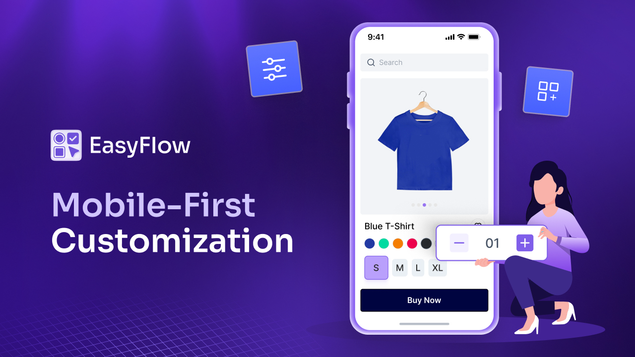
Mobile First Web Design Guide for Shopify
Over 70% of online shopping traffic comes from mobile devices. If your Shopify store is designed for desktop first and scaled down for mobile, you are already behind. A mobile first web design guide for Shopify means you start with the smallest screen and build up, not the other way around.
Here is what a mobile-first approach looks like in practice on Shopify:
- Thumb-friendly tap targets: Buttons and links need to be large enough to tap comfortably without accidentally hitting the wrong element. A good rule is a minimum of 44×44 pixels for any clickable element.
- Stacked layouts over multi-column grids: On mobile, a two or three-column product grid often looks cramped. A single or two-column stacked layout with larger images converts better on smaller screens.
- Sticky add-to-cart bars: On product pages, a sticky bar that follows the user as they scroll keeps the purchase action visible at all times. This is one of the simplest changes that consistently lifts mobile conversions.
- Fast-loading, compressed images: On mobile connections, heavy images kill your page speed and your conversions. Use WebP format and compressed images across all product and banner visuals in your Shopify theme.
💡A Shopify speed optimization web design guide will always start with mobile performance because that is where most of your traffic and most of your drop-offs happen.
High Converting Homepage, Product Page And Category Layouts
Layout choices are not just about aesthetics. They directly determine how shoppers move through your store and whether they reach checkout. This section of our web design guide for conversion focused websites focuses on the three most important page types.
Homepage Layout
Your homepage is not a sales page. It is a trust and orientation page. Shoppers who land here need to understand immediately what you sell, why you are worth buying from and where to go next.
A high-converting homepage in 2026 typically includes:
- A clear hero section with a direct value proposition and a single primary CTA
- A featured product or collection row placed above the fold
- A brief social proof strip showing reviews, press mentions or customer numbers
- A secondary CTA further down, pointing to a bestseller or new arrival collection
Avoid stuffing your homepage with every product category. Keep it focused and let the navigation do the rest.
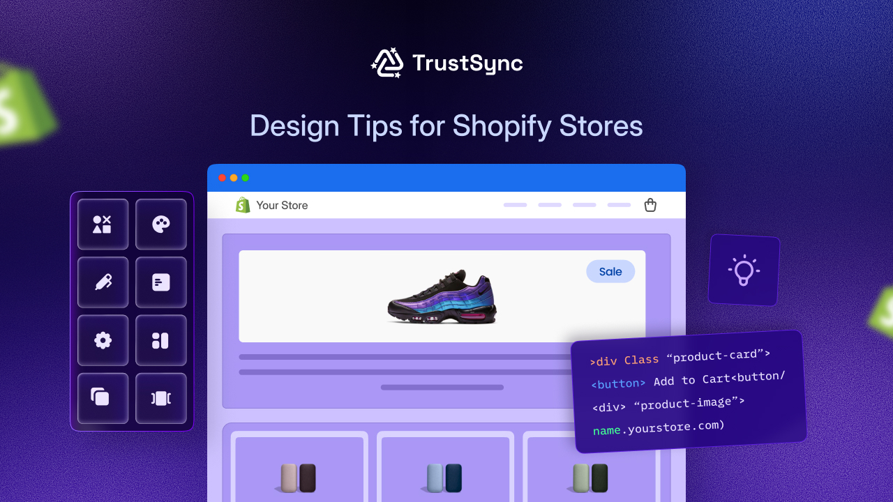
Product Page Layout
The product page is where the conversion decision is made. This is the most important page in any web design guide for product pages. In 2026, high-converting Shopify product pages follow a clear structure.
The layout should prioritize these elements in order:
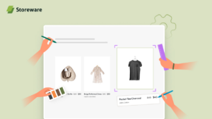
- High-quality product images with zoom and mobile swipe functionality
- Product name, price and variant selector within the first screen view
- A prominent add-to-cart button with a contrasting color
- Short benefit-focused bullet points above a longer description
- Reviews and social proof directly below the buy section
Keeping the most important information at the top reduces the need to scroll and removes friction from the decision process.
Category And Collection Page Layout
Collection pages are often overlooked in conversion optimization but they are critical for helping shoppers find what they want quickly. A clean grid with clear filter options, visible prices and consistent image sizing is the foundation. Adding a short category description at the top also supports your on-page SEO while helping new visitors understand the section.
Each of these three page types serves a different moment in the buyer journey, and your Shopify web design guide for 2026 should treat them differently rather than applying the same template to everything.
Shopify Checkout Design Guide 2026: Reducing Friction at the Finish Line
The checkout is where conversions happen or die. Shopify’s native One Page Checkout, introduced and improved in recent updates, is one of the most powerful conversion tools available to Shopify store owners in 2026. According to Shopify, their checkout is built to convert better by design, and store owners should take full advantage of it rather than overriding it with complex custom solutions.
Here is what a strong Shopify checkout design guide recommends:
- Do not add unnecessary form fields: Every extra field you ask for reduces completion rates. Ask only for what you absolutely need.
- Display trust badges near the payment section: SSL icons, secure payment logos and money-back guarantee badges reduce anxiety at the most sensitive moment of the purchase.
- Show a clear order summary: Shoppers want to see exactly what they are paying for before they confirm. A visible, accurate summary on the same page reduces second-guessing.
- Offer multiple payment options: Shopify Payments, PayPal, Shop Pay and buy-now-pay-later options like Klarna or Afterpay cater to different shopper preferences and increase checkout completion.
- Remove distracting navigation from the checkout page: Your header and footer navigation should not appear during checkout. The only goal of that page is to complete the order.
💡 The Shopify checkout design guide for 2026 is simple: remove every possible obstacle between the shopper and the confirmation page.
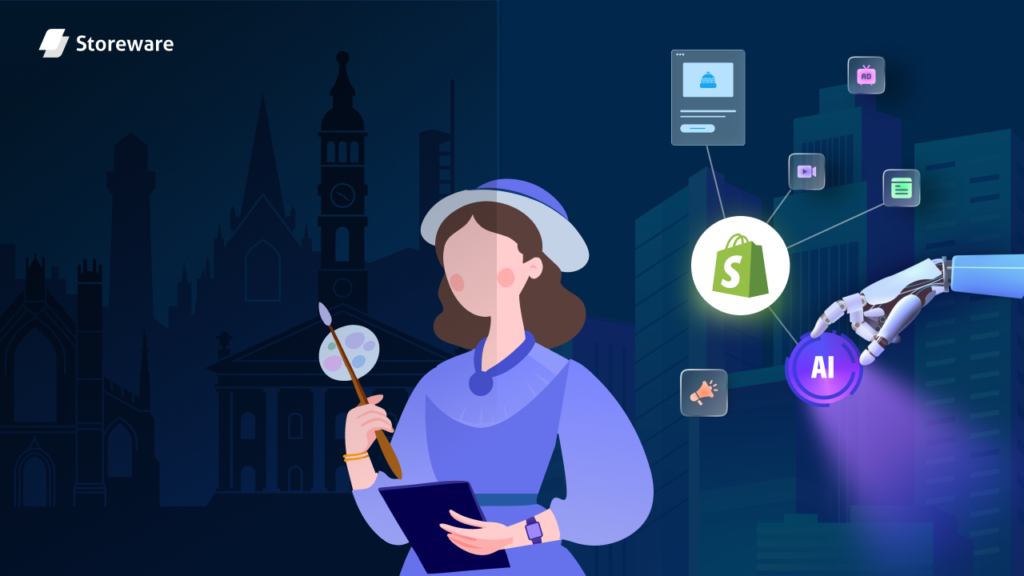
The Role of AI, Personalization And Social Proof in Shopify Design
AI-driven design is no longer a futuristic concept. It is already built into many of the best Shopify apps and themes available in 2026. The Shopify theme customization web design guide increasingly includes personalization as a default expectation rather than an advanced feature.
Here is how AI and personalization fit into your store design:
- Product recommendation widgets: AI-powered apps like serve personalized product suggestions based on browsing behavior. Placing these on product pages and the cart page increases average order value without adding friction.
- Dynamic content blocks: Shopify themes and apps now support content that changes based on the visitor’s location, device or past behavior. A returning customer sees different featured products than a first-time visitor.
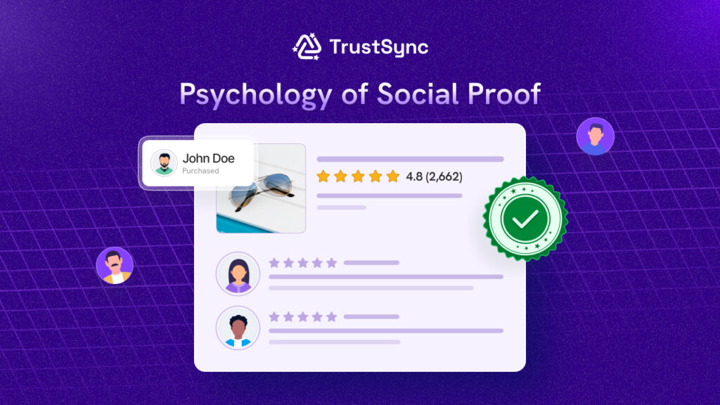
Social proof also plays a huge design role in 2026. Shoppers are more skeptical than ever and they look for signals that others have trusted your brand. Here is how to integrate social proof effectively into your Shopify design:
- Place star ratings and review counts directly on the collection page product thumbnails
- Add a reviews section on every product page, ideally with photos from real customers
- Use a recent purchase notification or a ‘X people viewing this’ widget strategically, but do not overdo it as it can feel manipulative if used excessively
A well-placed review or a real customer photo at the right moment in the buyer journey does more for conversions than almost any other design element. Trust signals and customer reviews are among the most important elements that drive eCommerce sales.
Common Design Mistakes to Avoid in 2026
Even experienced Shopify store owners make design decisions that quietly hurt their conversions. This web design guide for Shopify beginners and experienced sellers alike covers the most common mistakes to watch for.
The following are design mistakes that still appear far too often in Shopify stores:
- Too many popups too soon: A discount popup that fires within two seconds of landing on the site interrupts the browsing experience before any trust is established. Delay pop ups until after 20 to 30 seconds or trigger them on exit intent instead.
- Low contrast text on images: Placing white text over a light hero image makes your headline unreadable on mobile. Always check contrast ratios before publishing any banner or hero section.
- Oversized homepage sliders: Auto-playing image carousels with five or six slides are slow to load, rarely fully seen and almost never clicked. Replace them with a single, strong hero image with a direct CTA.
- Inconsistent branding across pages: Using different fonts, color tones or image styles across your homepage, product pages and collection pages creates a disjointed experience that erodes trust without the shopper being able to explain why.
- Ignoring page speed as a design decision: Site speed is not just a developer concern. Choosing heavy fonts, large uncompressed images or too many third-party app scripts are all design decisions that slow your store. The Shopify speed optimization web design guide treats performance as an inseparable part of good design.
Quick “What Works, What Converts” Checklist for Shopify in 2026
Before publishing any new Shopify page or theme update, run through this conversion-focused checklist. It covers the core principles from across this entire web design guide for eCommerce stores.
Use this checklist to review your store:
✅ Homepage has a single, clear CTA in the hero section
✅ Product images are high resolution, compressed and mobile-friendly
✅ Product page has price, variants and add-to-cart visible without scrolling on mobile
✅ Checkout uses Shopify’s One Page Checkout with minimal form fields
✅ Trust badges appear on product pages and the checkout page
✅ Reviews and ratings are visible on both collection and product pages
✅ Navigation is clean with no more than five to seven top-level menu items
✅ Page load time on mobile is under three seconds
✅ No auto-playing sliders with more than two slides
✅ Fonts are readable at 16px or larger on mobile
✅ Color contrast for all text meets accessibility standards
✅ Popups are delayed or exit-intent triggered
Final Thoughts: Design for Conversion First
A great-looking Shopify store that does not convert is just an expensive gallery. The best Shopify stores in 2026 are the ones that balance aesthetics with function. They load fast, feel trustworthy, guide the shopper naturally and make buying as easy as possible.
This web design guide has covered the key areas that actually move the needle: mobile-first design, layout structure, checkout UX, AI personalization and the design mistakes that cost conversions. Whether you are launching a new store or improving an existing one, applying even a handful of these principles will make a measurable difference.
If this blog helped you, subscribe for more simple guides, tutorials and tips to grow your Shopify store.